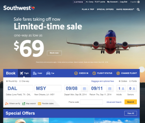
Southwest is having a press conference at Dallas Love Field this morning at 8:30 am to undoubtedly announce their new branding effort. Since I just happened to be on a flight this morning, I decided to check things out. Looking at the monitors, you will already notice the new logo in place with the multi-colored heart to the next of the Southwest logo with a newer updated font.
Notice the text is in proper case now.

The new logo features a new font and proper cased text.
Looking around the airport, the logo is present on podiums, signs, and more.
Here is the logo applied to the carry-on bag sizer. I wish more people used these. :)
I found this sign which gives a preview of what the new livery will look like once applied to the fleet.
The home page of the Southwest site has also been updated with a new look. It has a nice new crisp modern look. However, most of the site behind the home page remains the same.
I think this is a great new look for the logo. As someone who has been through a number of mergers / acquisitions, unifying the brand is an important aspect for both the people that make up the company as well as to your customers. The logo symbolizes a new era for Southwest as they expand into a new market.
At the press conference this morning, I expect Southwest to talk about the progress of the integration with AirTran, the expiration of the Wright amendment, and the latest on International flights into the Caribbean.


